Easy Bootsplash

Custom loading screen for web exports, which replaces the default loading bar on itch.io while your game downloads
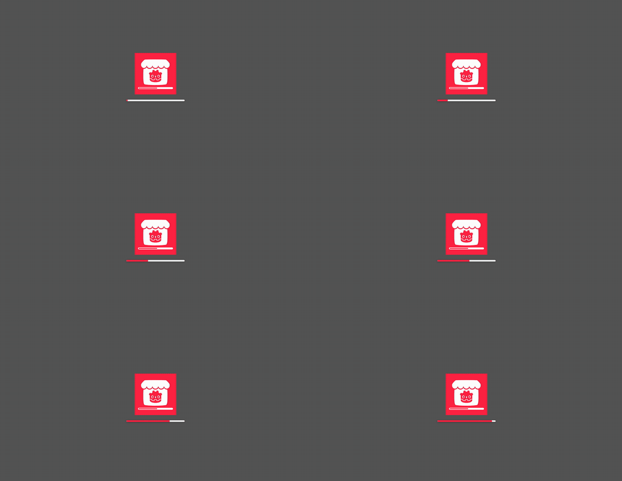 |
 |
| Defaults: art centered, bar below | image fit: cover with progress at the bottom |
 |
 |
| Full-width progress at the very bottom | Any custom HTML template of your own |
Try every option live on the test bench.
Usage
- Install the addon from Asset Store or from source (copy
addonsfolder to your project directory) - Enable the plugin in your Project Settings
- Replace
addons/easy_bootsplash/assets/backgroundwith your game icon or image - Tune the look in Project -> Export -> Web -> "Easy Bootsplash", mostly through
Parameters(reference below) - Export the project
Parameters
The Parameters dictionary is converted to JSON and accessible in the HTML template.
Can be used to control elements or behaviors
Existing properties:
| Key | Default | Notes |
|---|---|---|
background_color |
#5F5F5F |
|
fit |
centered |
cover / contain fill the screen with the art |
progress_hidden |
false |
true removes the bar |
progress_placement |
below |
top / center / bottom position it on the screen instead of under the art |
progress_width |
min(50vw, 360px) |
|
progress_height |
10px |
|
progress_radius |
999px |
|
progress_margin |
12px |
Gap between the bar and the screen edge / artwork |
progress_color |
#FF244A |
|
track_color |
rgba(255, 255, 255, 0.9) |
Two more keys apply even to custom templates:
| Key | Default | Notes |
|---|---|---|
progress_smoothing_ms |
600 |
Time to close 90% of the gap to the real progress, so the bar follows instead of jumping. Raise it for calmer motion that trails further behind, lower it for tighter tracking, 0 to step with the loader and let a CSS transition smooth it instead |
hide_awaits_full_progress |
false |
When true, EBS.hide() first drives the bar to 100% (animated when smoothing is on), then hides the overlay. |
Keys of your own reach the template the same way, as {{key}}.
_Note_: Only what JSON format can carry transferred to the page: _strings, numbers, bools, arrays and dictionaries_. The editor keeps the type you picked, so a bool is still a bool, while a
Coloror aVector2arrives as its Godot stringified form
Examples / Presets
Fullscreen key art, no bar.
{
  "fit": "cover",
  "progress_hidden": true
}
Art plus a thin bar pinned to the bottom.
{
  "fit": "cover",
  "progress_placement": "bottom",
  "progress_width": "100vw",
  "progress_height": "12px",
  "progress_color": "#7CFF6D"
}
Export options
The rest of the "Easy Bootsplash" section in the Web export preset:
| Option | Default | What it does |
|---|---|---|
Enabled |
true |
Turn the overlay off for a single preset |
Dismiss |
After First Frame Drawn |
When the overlay goes away, see below |
Template |
addons/easy_bootsplash/public/default_template.html |
HTML file to render |
Parameters |
pre-filled, see Parameters | Values substituted into the template and carried into the game |
Assets |
addons/easy_bootsplash/assets |
Directory copied next to the shell as ebs_assets/, recursively. .import files and dotfiles are skipped |
Dismiss values:
After First Frame Drawn: waits forRenderingServer.frame_post_draw, so the loader disappears right after the first game frame is drawnOn Engine Load: uses the engine's own start signal, which fires before the first frame, so the player might see an unfilled frameManually: nothing happens until you callEBS.hide()from GDScript, e.g. when your intro cutscene is ready to be seen
Custom templates
Copy public/default_template.html and point Template at the copy. The root element needs id="ebs"; the runtime finds it by that id. Tokens are substituted as plain text, and a parameter of the same name overrides a built-in token.
| Token | Value |
|---|---|
{{IMAGE_SRC}} |
Path of the background.* that was found, empty when there is none |
{{ASSETS_DIR}} |
Directory the assets were copied into, empty when unset |
{{PROJECT_NAME}} |
application/config/name |
{{any_key}} |
Any key from Parameters. Objects and arrays arrive as JSON |
Anything from Assets is addressed as {{ASSETS_DIR}}/logo.svg by its name.
<div id="ebs">
  <img alt="" data-src="{{IMAGE_SRC}}" />
  <p>{{tagline}}</p>
  <div class="bar"><i></i></div>
</div>
<style>
  #ebs {
    position: absolute;
    inset: 0;
    z-index: 3;
    background: #101014;
    display: flex;
    flex-direction: column;
    align-items: center;
    justify-content: center;
    transition: opacity 0.35s ease-out;
  }
  #ebs.is-done {
    opacity: 0;
    pointer-events: none;
  }
  .bar {
    width: 320px;
    height: 8px;
    background: #ffffff2e;
  }
  .bar i {
    display: block;
    height: 100%;
    width: var(--ebs-progress-percent, 0%);
    background: #7cff6d;
    transition: width 0.2s linear;
  }
</style>
Two CSS custom properties on the root element stay up to date:
#my-bar {
  width: var(--ebs-progress-percent, 0%);
} /* "42.00%" */
#my-ring {
  opacity: var(--ebs-progress, 0);
} /* 0..1 */
When the overlay is dismissed the root gets the class
is-done, then leaves the DOM 400 ms later, which is room for a CSS transition on that class.
Sponsor & Support
⭐ _Star_ ⭐ the repo if it saved you time
You can also support me here:

Changelog for version v2.0.0
2026-08-13 11:13:30
No changelog provided for this version.